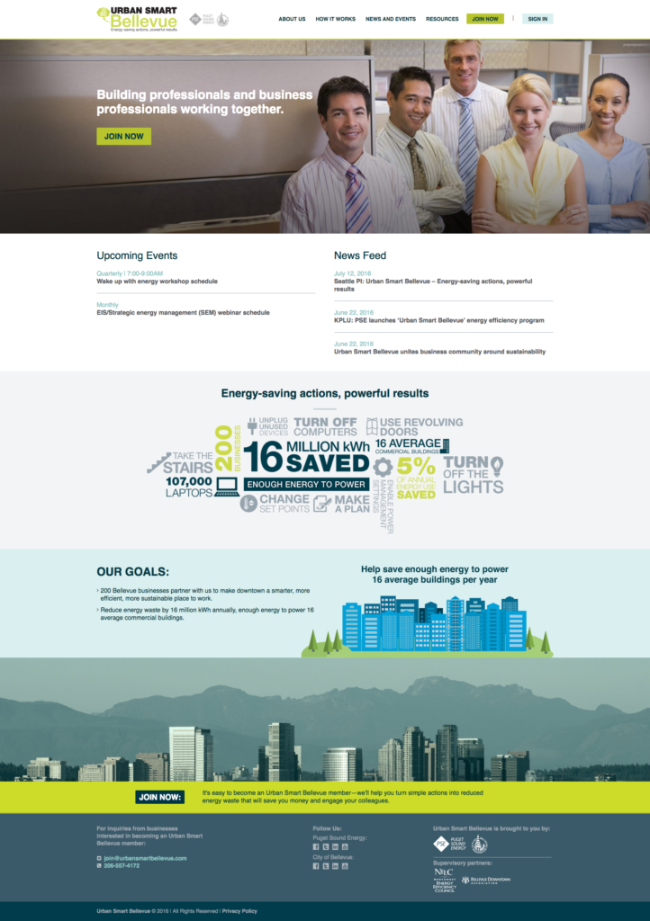
We recently undertook and completed a large project for the City of Bellevue and Puget Sound Energy called Urban Smart Bellevue. The Urban Smart campaign was created to raise awareness about energy conservation for businesses in metropolitan areas. Our ultimate goal for the project was simple: take a design and turn it into a functioning website. However, with most large scale projects, there was a lot of coordination and communication needed to complete the site.
The Design
After we received the design, we created a development site on our server with a fresh WordPress installation and starting chopping up the design files. We went through our normal process of starting from the top down on the design, from there we decided to take a look at unique features of the site that would require extra time to implement.
The Animated Graphic
The most unique feature on the Home page was the third section down labeled, “Energy-saving actions, powerful results.” We took this photo from its .jpg format and sliced each individual piece out into it’s own .png. Then, using some jQuery, we set a scroll point so when the viewer reached a certain point on the page, the images would start sliding into place. To create the sliding effect, we primarily used CSS transitions and absolute positioning. The only Javascript we used was to start the sliding action, set timers on each image to dictate when it would start to slide into place, and then update the absolute positioning to determine the end position of the image. Using the opacity, transition, and absolute positioning properties of CSS is what allowed us to create the fade-in and sliding effects on the images.
The Custom Posts
We added a slideshow plugin and then used a parallax jQuery plugin to add the parallax effect on the image above the footer. The rest of the design for the Home page was pretty straightforward. One of the more complicated aspects of building a site for a client is to create ways for them to easily input new content to the site without needing any coding experience. While WordPress provides a great interface to do this with standard page templates, when you are working with a custom design where you can’t just place all of the content in a block of text, you need to get a little creative with plugins or your code.
One of the sections on the Urban Smart site where we needed to add some custom content management was in the Upcoming Events and News Feed sections. The content in these sections is updated in one section of the WordPress dashboard and then automatically updates both the Home page as well as the News and Events page. We did this using a custom post type plugin which generates a new tab in the dashboard for News and Upcoming Events. From there, the client can easily input new content and that content is added to the site when they update.
The Stuff Behind the Scenes
(you can skip this section if you aren’t interested in how this is done)
When we use the custom post type plugin. Essentially what we are doing is using the plugin to create a new post in the database with a unique post type. In this case we used it for the Upcoming Events and News Feed post types. Each of the post types has custom fields that are associated with it. So when the data is stored, it is tied to to the specific post type. When you want to output this data, you will need to query the post type by creating an array that stores the post type information and a loop that cycles through the array. Within the array, you can apply parameters to filter the data as needed such as the number of posts that are returned in the array, the ordering of the posts (ASC, DESC, etc.), as well as custom fields within the post type.
Here is an example of an array and the query:
$args = array('post_type'=>'custom-post-type', 'order' => 'ASC', 'posts_per_page' => 3);

query_posts($args);
Once you have created your array and loop, you will need to call the custom field data within the loop using the get_post_meta WordPress function. Here is a sample of code that we used to store the data for the location of an Upcoming Event:
$time = get_post_meta($post->ID, 'wpcf-custom-field-slug', true);
This PHP variable stores the value for the specified custom field which you can then add to your HTML to dynamically output the data as you can see in the Upcoming Events section of the Home page.
The Back Pages
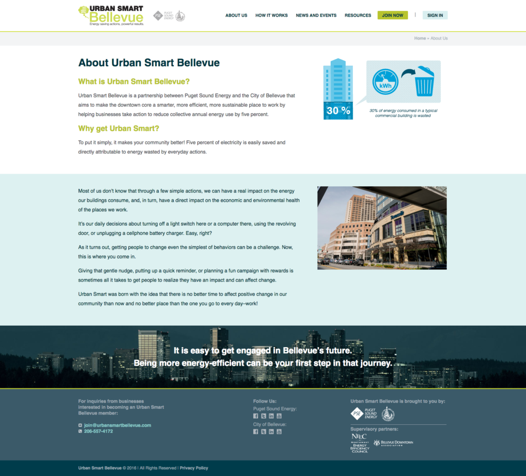
After we finished the design for the Home page, we needed to finish designing the back pages. These pages were, and generally are, less sophisticated and complex than the Home page. However there was still some customization needed to meet the design. As mentioned earlier we needed to use the News and Upcoming Events custom post types to update the content on the page. We also needed to create some custom fields that would appear on the About Us and the How it Works pages. To make the content easy to update, but still fit the design, we needed to use custom fields for the different sections of the pages. If you look at the About Us page, you can see how the content is split into two section, the top section with the white background, and the lower section with the blue background. In this case, we needed to create two separate content sections in the dashboard where the client can add content for each section. We also needed to create custom page templates for each of the pages since they each have a unique design. With a simple site, you can generally just use a default template for the back pages as they will all look the same structurally and just the content itself changes from day to day. With this site, the design was intended to make each page stand out in its own way. Generally, the more complicated the design, the more you will need to use custom fields to simplify the content management for a non-technical client.
The Responsive Design
As with all of our sites, we needed to make this site responsive. However there was a little more pressure to get the design right with the Urban Smart Bellevue project because we were provided with such a detailed design for the full site, but we weren’t given any information for the responsive design. Luckily, we are rarely given a responsive design so we have a lot of experience converting a desktop design of a site to the mobile version without much instruction. Sometimes when you are reducing the size of the screen, you as a developer have to sacrifice some of the content as it won’t all fit in a mobile design. Fortunately for us, the design we were given was designed in such a way that we were able to fit all of the content into the responsive design. Check the site out on your phone or tablet and see what you think of our responsive design.
The Summary
We managed to finish the site in time for them to launch their campaign. There is always a sense of accomplishment when you finish any project, but this one was a little more special than normal because it was a big project for a big client with a small amount of time to launch the site.


