

What is Responsive Design?
Responsive is a term that is thrown around the web world a lot these days and it is generally associated with creating a mobile-friendly website. While mobile is a part of responsive, responsive design is much more. A fully responsive website means that the website is responding to its environment. This means that the site will adapt to all screen sizes to maximize the user experience.
Why Responsive?
The biggest reason to incorporate responsive design is because more and more devices are being used to browse the web. Whether it is a smartphone, tablet, laptop, or desktop, there are many different screen sizes that users are viewing your website through. If you have a responsive website, then your site will look amazing regardless of the device.
How to Make Your Site Responsive
While it seems obvious that all websites should look just as good on a smartphone as it does on a 24″ monitor, it is easier said than done. Responsive design means that a single website adjusts itself based on screen size, using the same content and same code base. To accomplish this, the developer needs an understanding of varying screen sizes as well as how content will appear based on screen size.
How We Make a Site Responsive
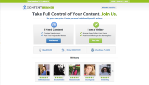
Our site, Content Runner, is a complex site with many intricacies that made the responsive work very complicated. Our goal was to make the site just as functional on a phone as it is on a desktop.
The initial launch of the Content Runner site was just a desktop version that would appear the same on a phone as it would on a desktop monitor. The biggest issue with this approach from a usability standpoint is that it generally forces the mobile user to zoom to click on links or select form inputs such as a search bar or button.
Due to the complexity of the site, we knew making the site mobile friendly would essentially be an entirely separate project so we decided to launch just the desktop version to at least make the site accessible to writers and people in need of writing. As we began the responsive work on the site, we also began to understand how difficult the responsive work would be. We had created a site with many different page layouts that each needed to be shaped and molded to fit on all devices. While there are general styles that can be applied across each page layout, it is the attention to detail that makes a site truly responsive.
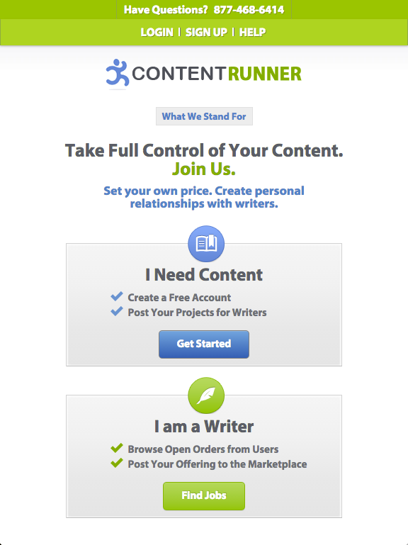
The home page of the site is a great example of that attention to detail. There are many different sections of information on the page. From the Call-To-Action buttons at the top of the page, to the list of writers, and further down to the list of jobs, there is a lot of information that is styled to look a certain way on a larger screen which we had to manipulate and rearrange to make it look equally as good on a tablet or a phone.
Ultimately we were able to successfully convert Content Runner from a site that was designed to be viewed on a desktop, to a site that can be viewed on any device regardless of screen size. We were also able to use Content Runner as a launch pad to showcase our proficiency in responsive design. We are very proud of the usability that Content Runner provides and our responsive design work is a big part of that usability.